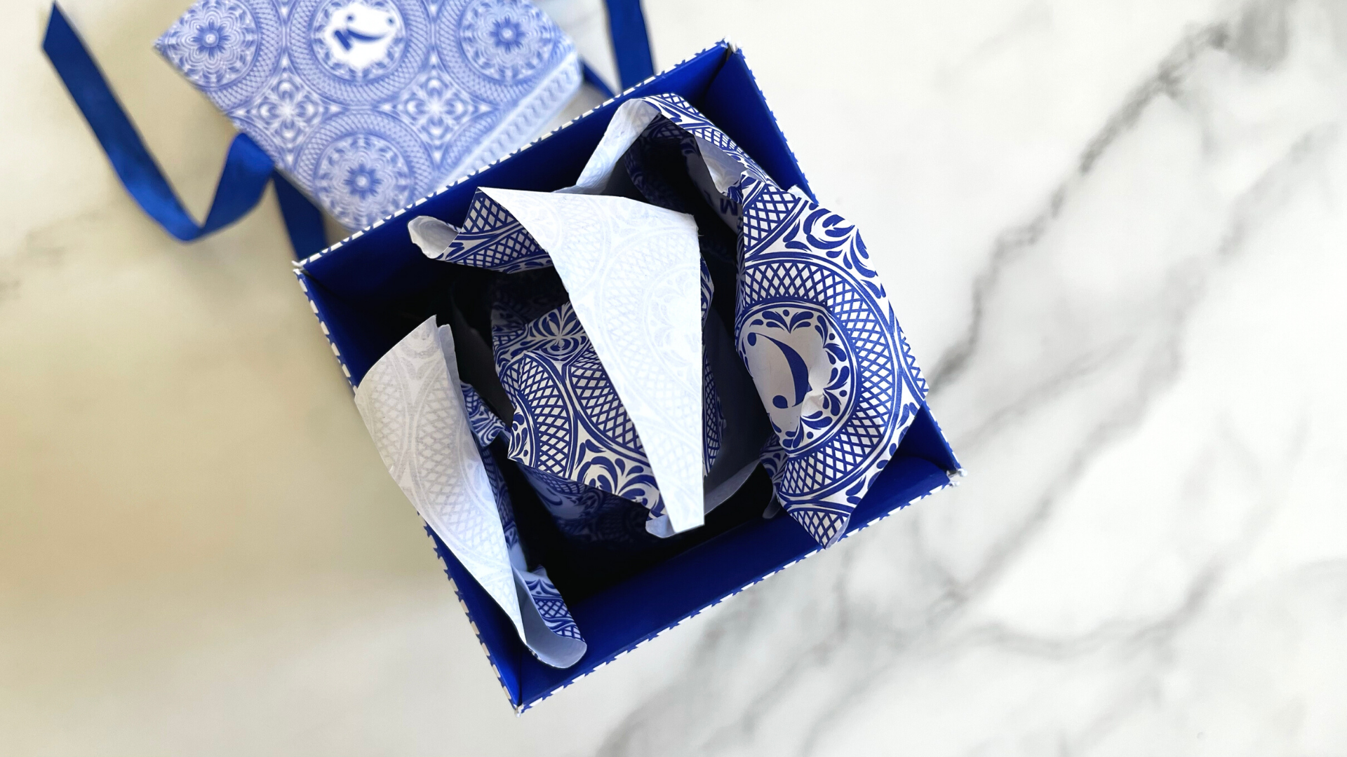
Print design is like an elegant dance: the more skillful the printer and designers are, and the more they trust each other, the more amazing the final product will be. For a powerful example look no further than this attention-grabbing packaging for Kállas First Press Olive Oil’s 2022 edition, which combines intricate Blue-and-White designs with an ingenious use of die cuts to create a powerful unboxing experience – all without a drop of glue to hold it together!
It’s no accident that this award-winning olive oil has featured fantastic packaging over the years; it’s produced by the Kállas family, owners of Metropolitan Fine Printers (MET) in Vancouver and given to MET’s clients as an annual gift. And with this year’s edition, beautifully designed by Letterbox Design, they outdid themselves.
Let’s start with the way it arrives in an oblong, corrugated brown shipping box. Since it opens at the top, your first glimpse of this piece is of an elegant, intricately designed hangtag resting on a similarly illustrated lid. As with everything related to this packaging, both boast Greece’s traditional Blue and White colors, reflecting the Kállas family’s proud heritage.

Credit: PaperSpecs
Sliding the packaging out of the shipping box you discover several breathtaking details the longer you look at it.
Going back to that hangtag, you now notice that it’s attached to the box by a Blue ribbon, which runs through a horizontal die-cut slit at the top of the tag, allowing the card to be positioned anywhere along the top or side of the box.
A closer look shows that the same ribbon runs through a similar diecut on one side of the lid, down through the bottom of the box itself, and up through the other side of the lid, ending in the elegant bow up top. From an engineering point of view this is already quite breathtaking. But of course they didn’t stop there.

Credit: PaperSpecs
Deeply debossed patterns cover the upper part of the packaging while the Kállas name, also debossed, appears prominently in the lower part, a Yellow accent mark over the “a” appearing to be the only printing on the box.
I say “appearing to be” because once you untie the ribbon and loosen it enough to lift off the lid you discover that it’s been concealing a Blue pattern running all the way around the lip of the box, perfectly complementing the one wrapped around the edge of the lid.
With the package now open you’re even more overwhelmed by Blue and White on the inside of the lid and around the interior lip of the box. The same Blue and White pattern glimpsed on the top of the lid also reappears, this time on the paper wrapped around the olive oil bottle inside.

Credit: PaperSpecs
Unwrapping the bottle itself, you discover that the label features the same debossed pattern and “Kállas” name as the packaging. Digitally printed on the side is a brief explanation of the product, as well as the number of the bottle out of the total number made. A card inside the box features a QR Code that, when scanned, supplies you with family recipes that rely on – you guessed it – Kállas olive oil!
All in all this is one of those pieces that leaves you stunned not just because of the way it looks, but also because of just how much thought went into it from an engineering and design perspective to make it all work together.
This article originally appeared on PaperSpecs.com, an innovative online hub for brand owners and graphic designers who actively spec paper and print and refuse to be limited by short print runs or tight budgets.


 Sabine Lenz


