

 Ashley Roberts
After 25 years on the market, Nutritional Brands, a natural ingredient supplement maker, had built a following of loyal customers, but, as Danna Pratte, owner and CEO, describes it, the branding needed “a facelift.” The supplement maker had multiple product lines underneath the overarching “Nutritional Brands” umbrella, but it wasn’t clear that all of its individual brands were connected within the same company.
Early this year, the legacy brand unveiled a new name, logo, packaging design, and even a new website. Now known as NB Pure, the supplement maker has transitioned its branding to be friendly and approachable, with a simplicity that encourages brand recognition.
The Journey to Become NB Pure
The idea to rebrand began a few years ago, initially with a packaging change for one of its brands, Aerobic Life. “But it really wasn’t resonating, even internally,” Pratte says. It also didn’t bring all of the brands under one brand umbrella. Pratte explains that the legacy brand had product lines, such as Aerobic Life and Pure Vegan, that all belonged under “Nutritional Brands.”

Danna Pratte, owner and CEO of NB Pure.
“We have really great products,” Pratte says, “and some of the things we were hearing from customers, was ‘Oh, I didn’t know you made that because it was in the Pure Vegan brand,’ or, ‘I didn’t know that you also made this.'”
So in December 2019, the company started the process again, this time for all of its products. NB Pure worked with SRW Agency to create the desired look and feel of the new branding.
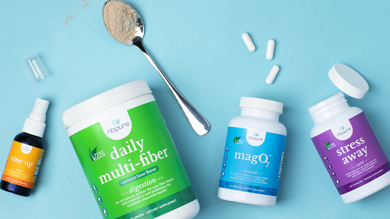
Not only did the company want to make it clear that all of the existing brands were under one overarching umbrella, Pratte explains that it was important to make it clear to consumers the benefits of each product, with easy to read and understand labels. That’s how the idea of four different product colors was born.
A Colorful New Beginning
If you’ve ever walked into a supplement or health food store, it can sometimes be overwhelming. That was the emotion that NB Pure wanted to eliminate. It broke its products down into four categories with a specific corresponding color: Boost (Orange); Care (Purple); Cleanse (Blue); and Digestion (Green). The four colors and categories were designed to make it more simple for the consumer to understand what the products are designed for.
“[We’re] really trying to drive home brand recognition and simplicity from a consumer standpoint,” Pratte says, “because I’ve been in this industry for a long time and sometimes I even get confused about what a product is supposed to do. … That was the No. 1 priority for us. Making sure that the consumers feel confident in the product … and to understand what the benefits are.”


The colors also help the packaging stand out on shelf where many other supplements utilize earthy, more reserved tones. They are intended to help build a connection between the consumer and the packaging.
“You know how sometimes you can’t necessarily remember the brand of something,” she says, “but you’d say, ‘Oh yeah, I remember it was in the green packaging.’ Just triggering those types of memories in consumers. … [We’re] making sure we’re getting into the memory bank of consumers.”
NB Pure even thought about how the typography on the packaging would affect consumer perception. Other supplement companies tend to use bold fonts or all capital letters on packaging, but NB Pure decided to take a different route.
“We chose to use lower casing on the product names, because we felt it was a little more friendly and approachable,” Pratte says.
The branding refresh has helped NB Pure appear more simple, friendly, and approachable, but the company has to continue to educate the end consumer. Pratte explains that it’s important to convey to consumers — as well as the retailers that they have worked with for many years — that although the product look has changed, the product itself is still the same integrity and quality that it has always been.
The educational piece of the rebranding doesn’t stop there. Pratte says that the process “is by no means over,” as there are still some of the old branded products in circulation.
Credit: NB Pure
The Right Packaging for the Right Experience
Although NB Pure just launched its brand refresh a few months ago, Pratte says she firmly believes the rebrand will increase sales across retailers and end consumers, as well as increase distribution in existing and new retailers. In fact, Pratte says she thinks the company will be able to double its sales over the next year, as soon as all of the products are rolled out.
“Working with [existing retailers] and showing them what it is, they’re excited to expand their product offerings that they have in our brand because they want something bright and fresh on shelf so that when consumers come in, they’re excited about the whole shopping experience,” she says.
Overall, Pratte says that the rebrand was developed to create a more user-friendly experience. From the color coordinated packaging, to the company’s new social media and e-commerce experiences, NB Pure is striving to give consumers confidence in its product’s benefits.
“You can have really amazing products,” Pratte concludes, “but if you don’t have the right packaging and consumer experience, then you don’t get the result you want.”