


 Leah Wynalek
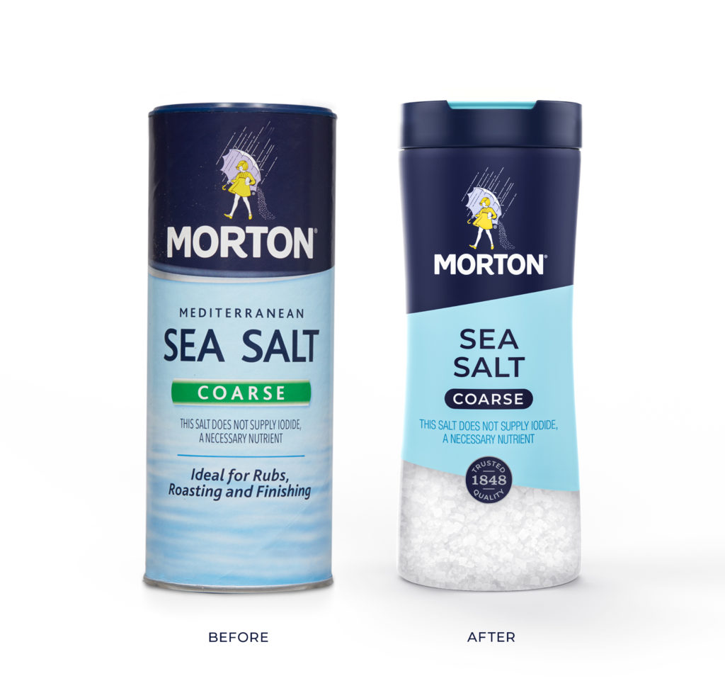
Morton Salt recently debuted a contemporary redesign of its entire retail portfolio. While the iconic Morton Salt Girl maintains her central spot on the packaging, the new look incorporates bolder colors and updated typography that the brand hopes will attract younger shoppers.
“One of the goals of this re-design was to help drive greater awareness, visibility and shoppability of our full portfolio of products,” says Denise Lauer, chief marketing officer at Morton Salt. “The end result is a more modern, premium and cohesive look across our culinary and home care lines that will help Morton stand out in-store and on the digital shelf.”
Some packaging for the brand’s culinary product line, including specialty salts and seasonings, also features QR codes that consumers can scan to access recipes, cooking tips, and augmented reality experiences.
We caught up with Lauer – along with Clark Goolsby, chief creative officer at Morton Salt’s agency partner Chase Design Group – for more details about Morton Salt’s packaging redesign and marketing direction.
What prompted Morton Salt to refresh its product packaging?
Denise Lauer: Packaging is one of Morton Salt’s main touch points with consumers in terms of reach. Yet Morton has not launched a graphic redesign of its entire consumer products portfolio since 2014. Even iconic brands need a refresh from time to time.
This packaging refresh is also part of a broader, multi-year brand modernization effort designed to help strengthen Morton’s appeal and relevance, particularly among millennial consumers.

Denise Lauer, Chief Marketing Officer at Morton Salt
Describe some of the key design differences and the intent behind those changes.

Clark Goolsby, Chief Creative Officer at Chase Design Group
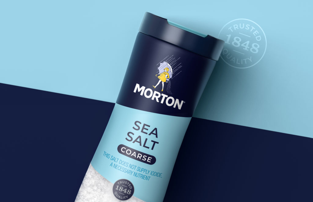
Clark Goolsby: The new design for Morton Salt has two key differences from the previous design. First, the previous design was built on a rigid system that did not allow for Morton’s key brand assets to be leveraged effectively across all their various shaped packages. The new system was designed to be flexible, and allowed us to maximize the Morton Salt Girl and Morton Salt wordmark on every structure. The system also allowed us to adjust the amount of Morton blue per package. This made more room for variant colors and windows without compromising the brand block at shelf.
The second difference from the previous design was modernizing the graphics. By simplifying typography and using a series of bold, flat graphic shapes, we were able to update the brand while still keeping it recognizable.
How will the AR integration with the new packaging improve the customer experience?
Denise Lauer: This augmented reality experience will enable consumers to engage with Morton Salt in an entirely new way, and enhance their overall experience with our brand and products.
For the first time, we will transport consumers into the world of Morton Salt through more dynamic interactions with our culinary products, recipe content and the Morton Salt Girl.
The new packaging integration will unlock various augmented reality experiences that are designed to help educate, inspire and even entertain consumers. For example, we will:
- Share tips and tricks to educate consumers on salt usage,
- inspire mealtime by offering up new recipe ideas, and
- delight consumers with opportunities to interact with the Morton Salt Girl.
Why is it important to connect the in-store or in-home experience with digital?
Denise Lauer: Consumer behavior has changed quite dramatically this year, largely due to COVID-19. We know consumers are buying more online, cooking frequently at home, and spending their time differently.
As consumer behaviors around shopping and cooking continue to shift, there is no better time than now to enhance our digital offerings. That’s why Morton is providing more connected experiences through our updated packaging, and delivering helpful content through our Alexa Skills, influencer partners, and digital and social channels.
Have the materials or production of the packaging changed in any significant way?
Clark Goolsby: The only major change to materials and production was new structures for some of the salt canisters. These structures allowed consumers to see the salt at shelf, and had a much better cap that allowed for easier pouring and shaking.
Is there anything else you’d like to share?
Denise Lauer: Most consumers know us best for the iconic round blue canister of table salt that made Morton famous. But there is so much more to Morton Salt.
We have a full range of culinary salts including Sea Salt, Kosher Salt, and Himalayan Pink Salt as well as specialty salts and seasonings. And this is just our culinary portfolio. Morton also makes a variety of home care products, including water softener salts, pool salt, and ice melters. In fact, we updated Morton Salt’s entire retail portfolio with this packaging refresh – that’s approximately 250 SKUs!