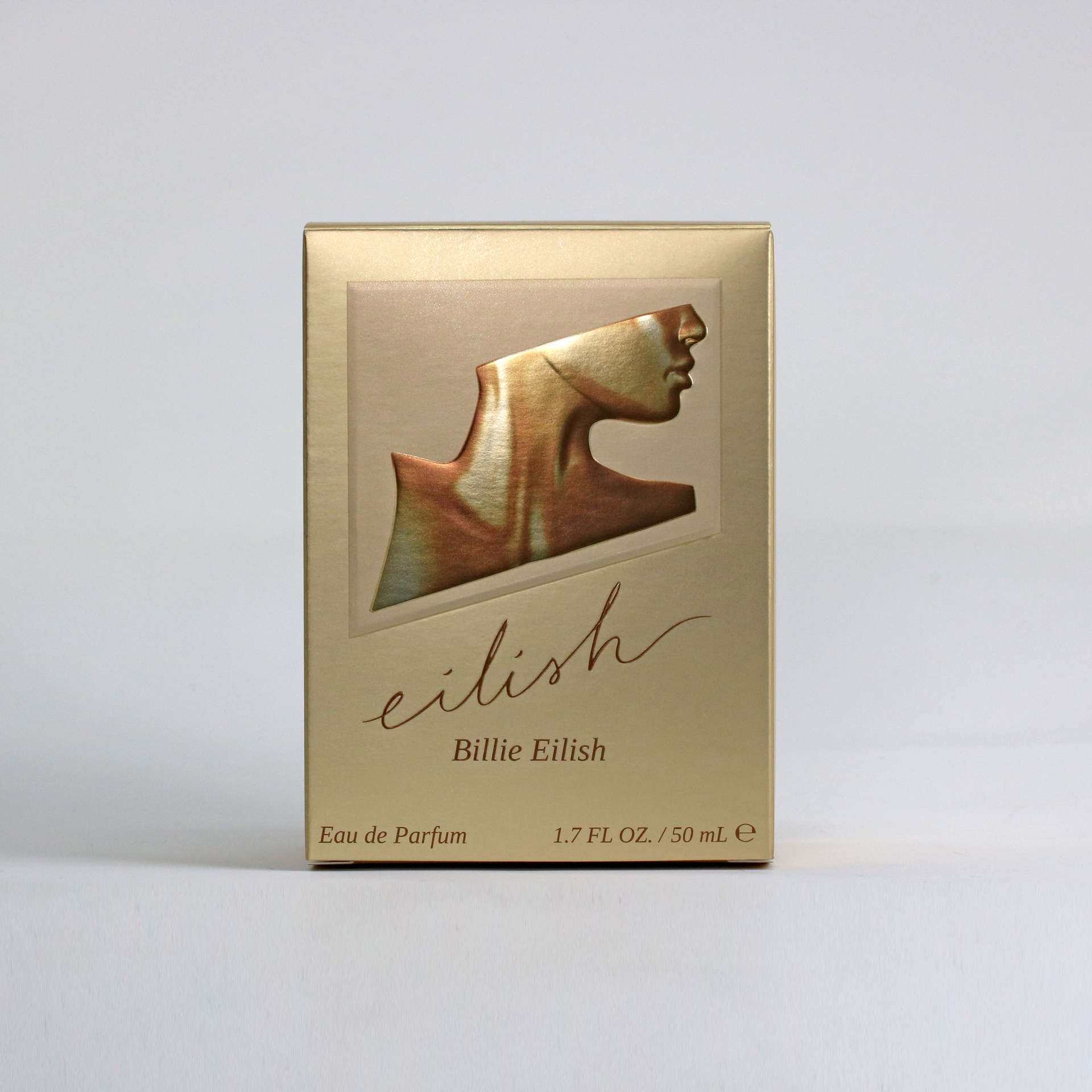
When it came to releasing her first perfume, singer-songwriter Billie Eilish needed to make sure the packaging was just right. It needed to reflect her music, her brand, and her love of the human body, as well as the environment: But most importantly, it needed to reflect her.
“Fragrance has always been such an enormous part of my life and existence since I can remember, and it was a dream to create this scent and bring my ideas to life,” Eilish wrote on Instagram.
According to a case study released by Diamond Packaging, Parlux Ltd. partnered with Diamond to create packaging that captures the essence of the musical artist … and they were able to do it sustainably.
Creative Design
The Diamond Packaging case study confirmed that NYC-based Jon Michael Design was responsible for the branding, package design, and content creation for the Eilish fragrance product launch. With Eilish’s love of the human body serving as the inspiration for the design, the agency worked closely with Eilish to create a breathtaking silhouette of a body with fluid lines to introduce Eilish to the world.
Focusing on the Environment
To achieve the sustainability aspect, the case study said that the cartons were converted utilizing FSC-certified BillerudKorsnäs CrownBoard Prestige paperboard. It was also offset printed with a four-color process, UV PMS brown, and UV gold inks, in-line with DiamondTouch soft touch coating, UV matte coating, and UV gloss spot coating over Envirofoil.
BillerudKorsnäs’s paperboard was chosen because of its unique combination of formability, strength, and printability, as well as its environmental aspects. It’s printed with 100% primary fibers, which makes it have a lighter environmental impact.
The perfume box’s glossy, mirror-like finish is also easy on the environment. Transfer metallized Envirofoil is manufactured with less than 1% of the aluminum of traditional foil laminates, reuses the film carrier multiple times, and is as recyclable as paper. It is also certified by numerous U.S. and European laboratories.
The case study also mentioned that the cartons were manufactured using 100% clean, renewable, wind energy and produced in a Zero Waste to Landfill and a Carbon Neutral facility.
Tactile Elements
Even though it’s a perfume, Diamond worked to appeal to more senses than just smell using the overall DiamondTouch soft touch coating. Adding an appealing tactile quality that is meant to promote consumer interaction. Diamond also employed the use of multi-level embossed accents like the metallic bust on the front of the box. The raised bust adds dimension that a consumer can glide their fingers over.
Not to mention, it also complements the design of the primary container, which is a bottle that appears to be gilded in amber bronze and inspired by Eilish’s favorite areas on the human body: the collarbone, neck, and back.
A Multi-Sensory Experience
Between touch, smell, and eyesight, the end results of the packaging for Eilish is a sophisticated and stunning presentation that intrigues the consumer and delivers a multisensory consumer/product experience through unique visual depth and tactile techniques.


 Gabrielle Houck


