


 Sabine Lenz
At a time when absolutely everything seems perfectly designed, many of the pieces that stand out today are those that celebrate the beauty of roughness and imperfection. This is at the heart of the branding for Hong Kong’s L’Envol restaurant, which marries French fine dining with the chef’s own philosophy of “fine rawness.”
The business cards, stationery and menus – designed by, Oddity Studio and produced by Service Print and L.Force – provide an intriguing mix of rough and smooth uncoated papers, transparent sheets and foil. These all tie in nicely with the restaurant’s interior, which blends elegant marble and gold textures with massive ceiling lights made of raw crystal.

Credit: PaperSpecs
Let’s start with the business card. Like many of the pieces, this is printed on handmade paper from Somood or in this case, 2 different papers. The front is a smoother, uncoated sheet die cut along one side to mimic a rough-edged tear. And as the restaurant name “L’envol” means “flight,” the foiled logomark “L” on the front is elongated to suggest take-off, leaving no one in doubt of the “high-end” culinary experience that awaits them. This sheet was then duplex laminated onto a rougher second sheet upon which the pertinent contact information is printed above the restaurant’s name, which is rendered in Gold foil.
Credit: PaperSpecs
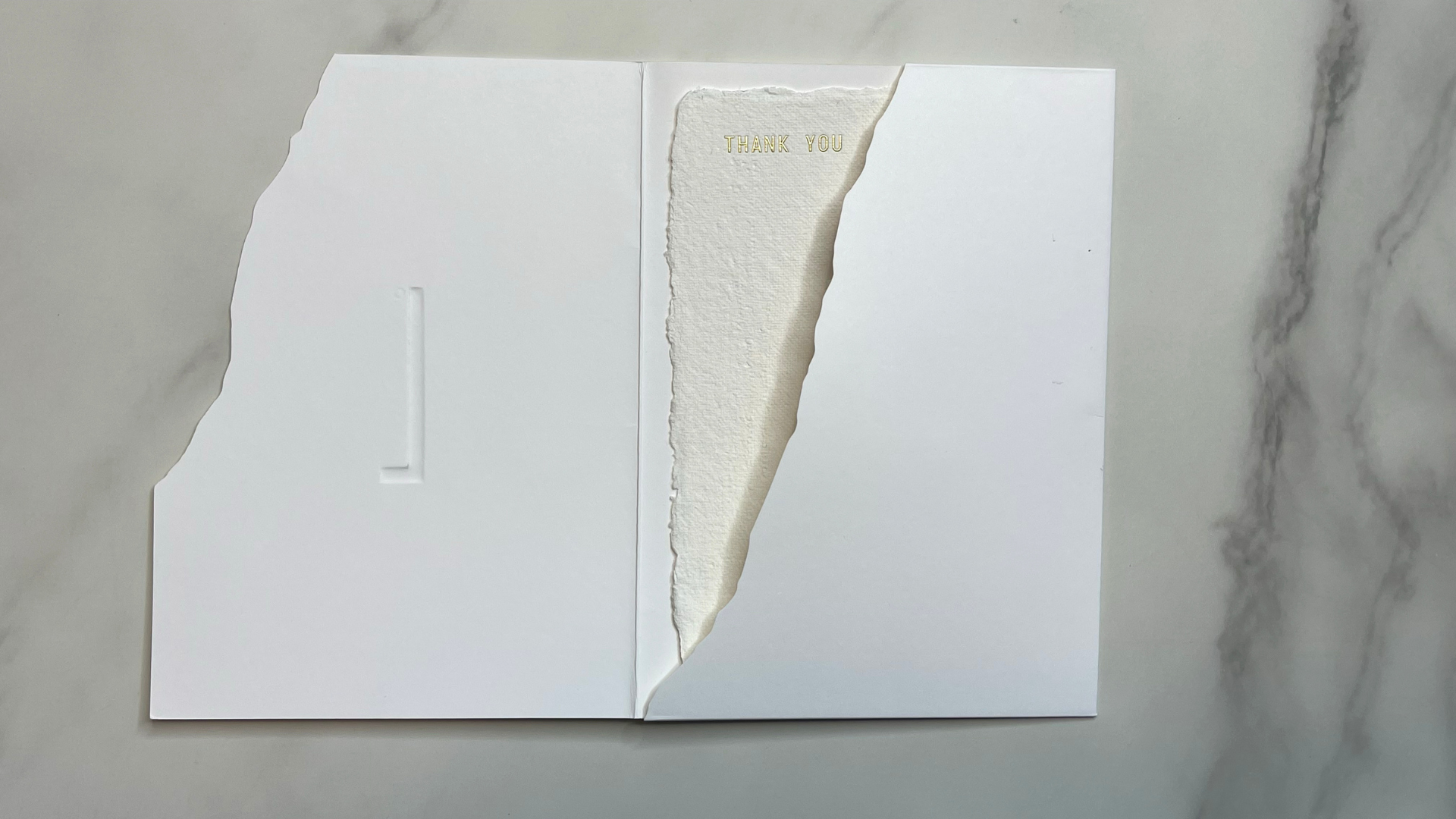
A similar look appears on the pocket holder for the “thank you” note, with the same Gold foil logo on the front, as well as the die-cut “tear” along the right edge of the flap. Lift that flap, however, and the tear appears again on the edge of the inside pocket, allowing the Gold foil “Thank you” on the actual note card inside to peek out.
Credit: PaperSpecs
The pièce de resistance, though, has to be the menu itself.
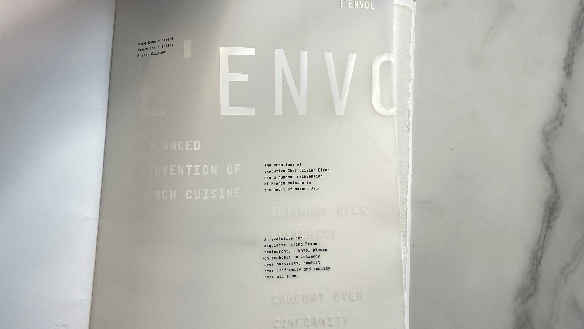
The front cover continues the “tear” motif but adds a Gold elastic band binding. Lifting the cover reveals a translucent synthetic first sheet with the restaurant’s name in Gold foil, as well as a typographic smorgasbord rendered in White foil, White ink, White registered emboss, and Black ink.
Turning the page, you find the restaurant’s offerings printed in Black ink on substantial deckle-edged paper. Unlike the die-cut covers seen up till now, the paper here is truly deckle edged, perfectly in keeping with this establishment’s “fine rawness” theme.
Credit: PaperSpecs
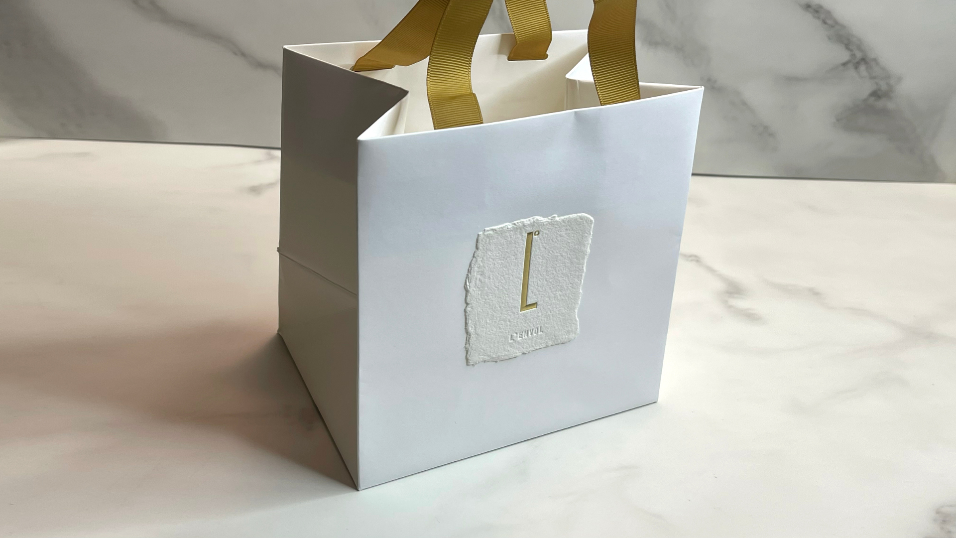
Topping off the experience is a smart and stylish gift bag made from sturdy White Cover stock. A small swatch of the same rough, deckle-edged paper we have seen in the menu is affixed to the front, complete with that familiar Gold foil “L,” and the name subtly blind debossed just beneath. Gold ribbon handles complete the look nicely.
This avant-garde blending of foil and handmade papers makes the restaurant’s brand stand out, while giving a tasty new meaning to the phrase “take the rough with the smooth.”