


 Sabine Lenz
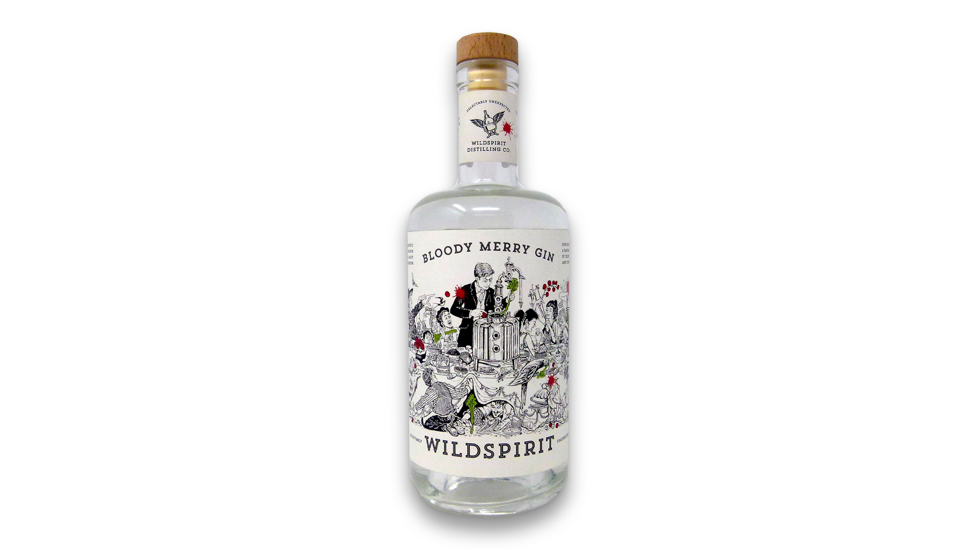
Boutique spirits are booming, and gin makers especially have become increasingly more adventurous in their branding. Many labels feature sophisticated typography, exquisite patterns, and the occasional spot of line art. But where is the sense of fun that the spirits themselves are meant to bring about? Drinks design studio Denomination remedied this oversight with the name and look they came up with for Wildspirit’s Bloody Merry, which features an illustrated label that reflects the wild, and occasionally messy, experimentation process that led to this gin’s creation.
A Wildly Unconventional Label
Passionate about bringing an irreverent energy to the spirits world, Wildspirit Distilling added some highly unconventional infusions –celery and cherry tomatoes, alongside more traditional botanicals – to their Bloody Mary gin. Their twist on the name, and the packaging, perfectly capture this irreverent personality.
Credit: PaperSpecs
Right off the bat this label practically leaps off the shelf thanks to a cartoonish illustration used to convey the brand story. Were it a drink recipe, it might be described as:
- Two parts “Jeeves & Wooster” insanity
- One part Art Nouveau
- With a jigger of Mad magazine thrown in for that extra kick.
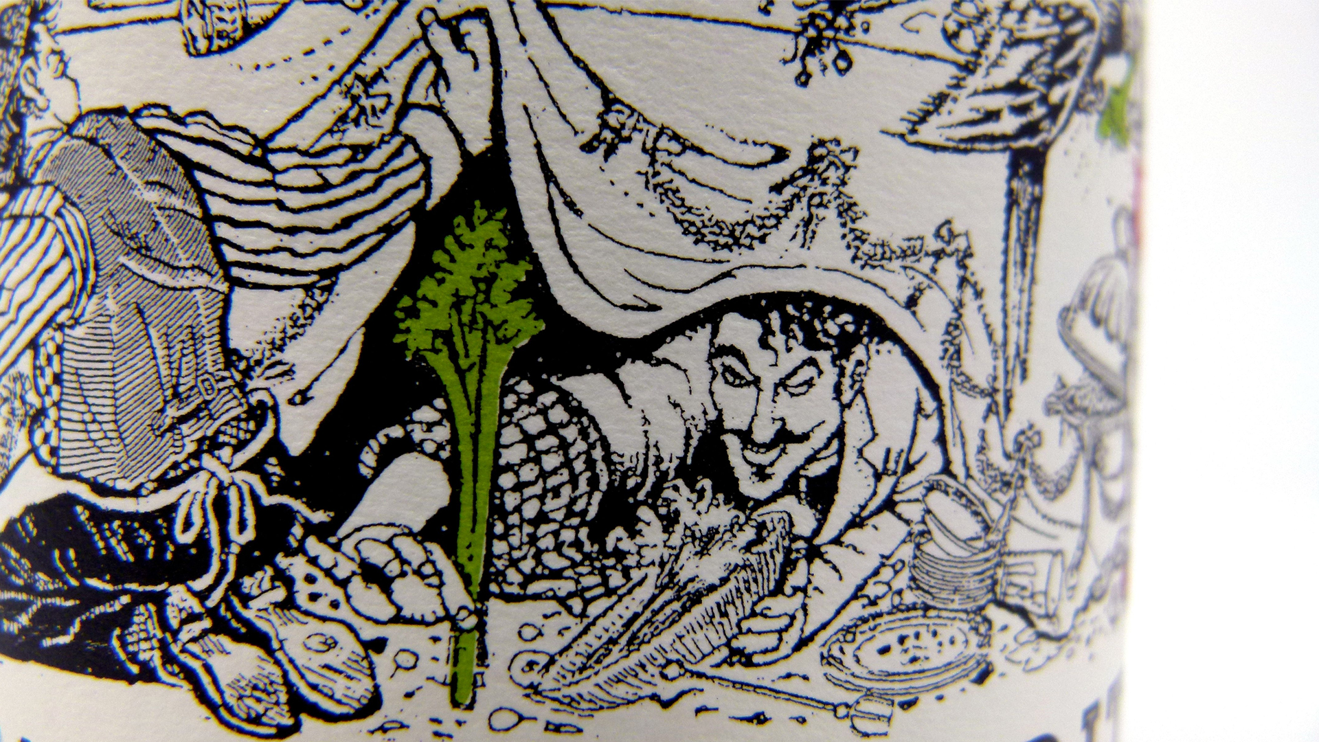
Offset printed on Neenah’s Estate Label No. 8 Bright White Vellum, the Bacchanalian scene depicted here was inspired by the client’s own stories about the way he tests out his new gin infusions on friends at dinner parties. The distilling mechanism shown at the center of all the action at this uproarious sampling party emphasizes the hand-made quality of the beverage inside the bottle, as does the intricacy of the illustration itself, from every strand of hair right down to the individual crumbs of food dotting the tablecloth, plates and flooring.
Credit: PaperSpecs
A Mad Dash of Color
They also added a splash of Red and Green ink to the tomatoes and celery stalks in the artwork to highlight these unique ingredients, which are used in the making of Bloody Merry.
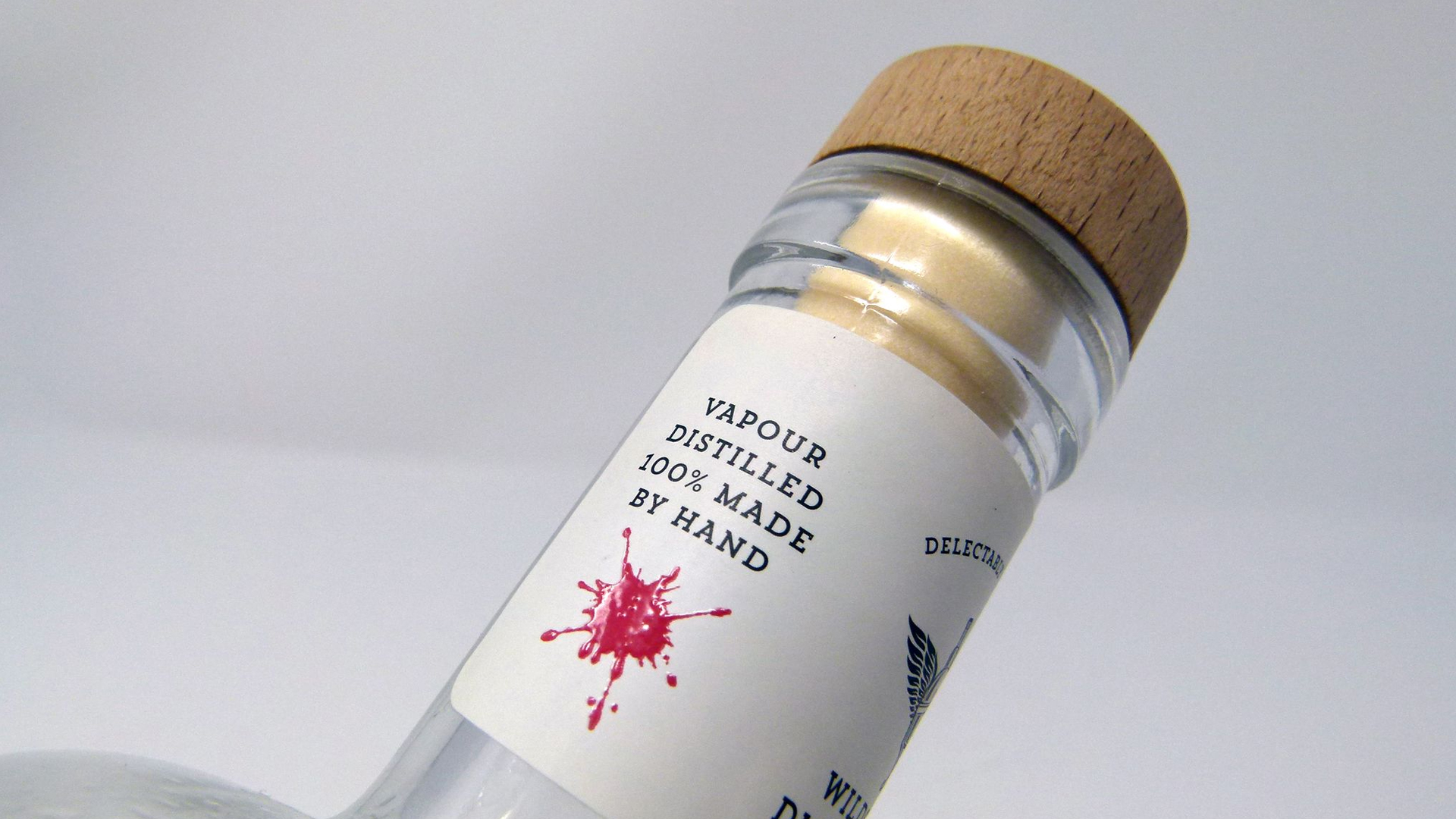
To emphasize the handmade character of the gin, the neck label calls out the bottle and batch numbers of the gin.
The finishing touch? Red Spot Gloss UV, which was used to draw attention to the places on the label where a tomato had been figuratively “splatted.”
Credit: PaperSpecs
The result, the designers explain, is what happens when the client is both deeply involved in the creative process, and skilled at communicating their passion and inspiration for their brand to a creative team. And if a few tomatoes have to be “splatted” in the process, well it’s all in the name of good, gin-soaked fun. Cheers!
This article originally appeared on PaperSpecs.com, an innovative online hub for brand owners and graphic designers who actively spec paper and print and refuse to be limited by short print runs or tight budgets.