Mohawk’s Sustainable Renewal Hemp Line Brings Quality and Consistency to Field Notes’ Quarterly Memo Book
Mohawk’s Sustainable Renewal Hemp Line Brings Quality and Consistency to Field Notes’ Quarterly Memo Book
Field Notes — a company that has specialized in producing 48-page, 3.5x5.5" notebooks since Jim Coudal and Aaron Draplin formed the company in 2006 — has released limited-edition quarterly versions of its popular pocket-sized notebooks since 2009. With so many versions produced each year, it might seem impossible that the company is able to continue to innovate and refresh the product line. Although it’s bound to be challenging, Bryan Bedell, who has been heavily involved with the design, production, and photography at Field Notes, explains that the company not only thinks about what the books will look like each quarter, but it explores a variety of materials to set them apart.
“Every quarter, we’re looking for a new design,” he says. “More materials, inks, papers, processes. … Anything we can find just to keep doing new things for these quarterly editions. When there’s a new paper available, we usually look into that and see when we can tie that into something we’re doing.”
In fact, materials end up being one of the most important variables in Field Notes’ quarterly product releases.
“We don’t change the design that much,” Bedell explains. “So, we’re really only changing the materials, and we’re only changing the printing and the colors and the processes.”
One of those materials, of course, is the paper used to bring the designs to life. The Fall 2021 quarterly release, called
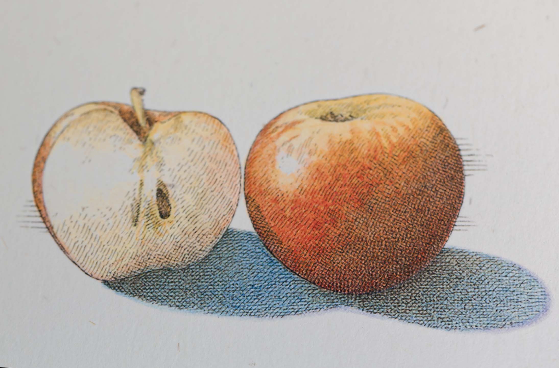
“Harvest,” features six versions of the notebook with beautifully colored and embossed fruit and vegetable illustrations by American artist John Burgoyne. Field Notes needed to find a substrate that would complement the illustrations and designs in the best way possible. To do this, it turned to Mohawk Fine Papers.
Harvesting the Right Materials
Burgoyne is known for traditional-pen-and-ink, watercolor, and colored pencil “old school” illustrations, so Bedell explains why it made sense to find a fibrous cover paper to give the books an old-fashioned look and feel.
Field Notes found what it was looking for in Mohawk’s Renewal Hemp 120#C Fiber White Rough paper, which is part of the company’s “Renewal” line.
“We wanted something with some fiber in it,” Bedell says. “Just looking at all the different fiber, off-white papers, that was just the color that stood out to us the most. I think a lot of off-whites are either too yellow or too brown. It was the right tone for us, and then the amount of fiber in it matched what we wanted to do. … It’s just the right amount of fiber and the right amount of texture to really call out the illustrations and make them look like they’re hand-drawn on the paper. … It feels organic.”
Mohawk Renewal Means Responsible Papermaking
Although Field Notes ultimately chose Mohawk’s Renewal Hemp paper made with 30% hemp fiber for the cover of the Field Notes “Harvest” Fall 2021 product, the sustainable portfolio of papers also offers options made from straw and recycled cotton fiber, in seven different colors with two options for finishes.
As Mohawk describes it, the product line was “driven by a desire to redefine the contours of fiber sourcing by rediscovering legacy materials like hemp, straw, and cotton rag — we are, in essence, looking to the papermaking methods of the past to chart a more sustainable future.”

Materials Matter
At Mohawk, it is said that “Materials Matter.” Bedell says he agrees “100%.” That mindset led Field Notes to choose a substrate that would align perfectly with the theme chosen for the quarter.
“It really is about the materials for us,” he says. “The paper is part of the product, and it’s been great working on these. Every month, or every quarter, you’re coming to the project with the template already done. The layout’s pretty much done and you’re looking at ‘What paper can we use? What else can we do to make this different and special?’”
For the “Harvest” Fall 2021 edition, that meant finding a paper that would highlight the delicate nature of Burgoyne’s illustrations, while being sturdy enough to stand up to embossing. Mohawk’s Renewal Hemp line matched what Field Notes was looking for, and offered a consistency that was crucial since 30,000 copies of the “Harvest” line were produced, grouped in packages of three.
“We’ve had times where we’ll get six pallets of paper, and three of them will be a noticeably different shade than either one,” Bedell explains. “Since our books get mixed together in different packs, that’s a huge problem for us. … In this one, from sheet to sheet, the fiber was very consistent, and the color was very consistent.”
With the cover paper determined, Field Notes went forward with producing the “Harvest” notebooks, which were printed by Cicero, Illinois-based Active Graphics using a six-color, 40" Komori Lithrone S40 offset press. The front cover images were printed in four-color using process-color soy-based Saphira Ink, while the back cover colors drew inspiration from the illustrations on the front. The embossing highlights the illustrations of the fruits and vegetables, but not the shadows, which gives the image more texture.
Bedell explains that because the Field Notes notebooks are a higher-end product, the level of detail in the imagery and the substrates chosen are also very important.
“We want the printing to be perfect, and we want everything to be perfect,” he says. “We’re charging a reasonable amount of money for them, so we don’t mind going to a higher grade [paper] just to be completely sure that we’re going to get good print quality and good texture and consistent paper.” 


